What problems are these web pages solving? What visual challenges are there?

The commerical driver of this website is to generate a sales environment that captivates people long enough to make them buy stuff. This is the problem that ASOS must solve.
For a consumer, ASOS is about providing them with "something" that fufils their needs and wants, often this is emotionally or psychologically charged. To go into this a bit further, the problem that ASOS is solving for the consumer is how can they provide good quality clothing, at low cost, quickly.
With these problems in mind, the visual challenge for ASOS stems from its insanely massive inventory - and I'm talking massive, literally thousands upon thousands of products. How can they possibly display everything, or categorise so that each item gets its deserved online exposure and opportunity to be part of your wardrobe?
The UX seems pretty intuitive. They've played up their divs/containers momentously to simplify content, to classify styles, everything is categorised. The below wireframe shows a small header, a giant content and a somewhat larger than normal footer. This seems appropriate for ASOS - they need to visually execute effectively to push people down their sales rabbit holes and hold interest for as long as possible on their site.

The problem that Airbnb is solving is how to provide alternatives to hotel accommodation that can be personalised, trust-worthy and attractive.
The visual challenge they face much like ASOS is how to effectively display all their listings, and how this will provide equal opportunity for both guest and host.

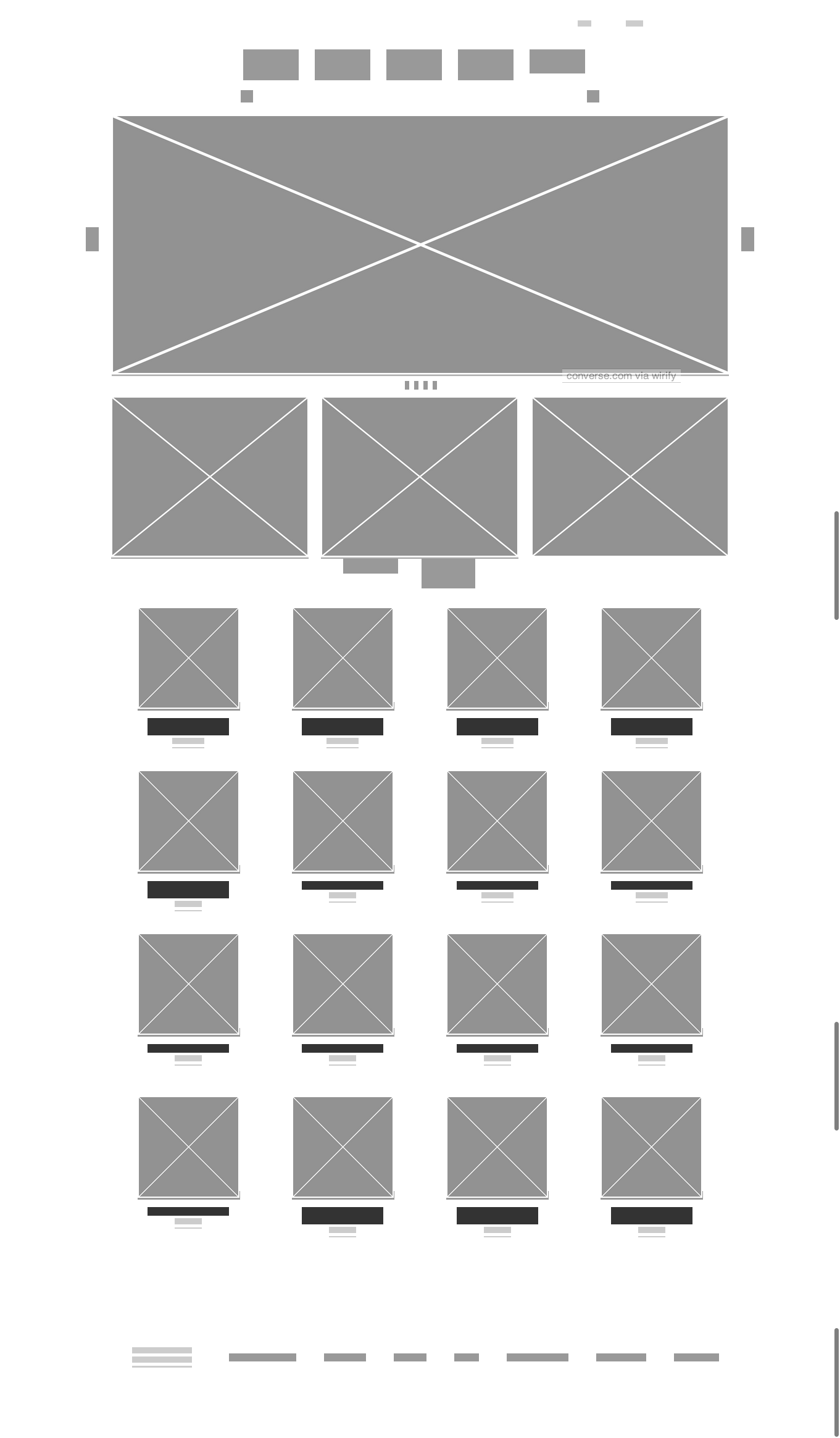
To me the most interesting problem that the Converse website is solving is how to make people design their own shoes online.
The biggest visual challenge is to provide an approriate environment where you can design a shoe and you feel you are being creative. But there are constraints.